Our learning design experts share some tips and tricks for creating visually captivating screens.
When it comes to designing screens for eLearning modules, it's all about balance – you don’t want to overload your pages with walls of text or redundant multimedia assets, but you also don’t want to end up with lots of unused screen space. The following tips will help you to organise your screen layouts for a more learner-friendly experience.
Backgrounds
Every theme in Guroo Pro has a set default background. These backgrounds will automatically appear once you have selected your theme. If you like the default background, there is no need for you to change it, however, to add variety, incorporate images, or to set a scene, add a background to your screen. Your background can be:
- An image
- A plain colour or gradient
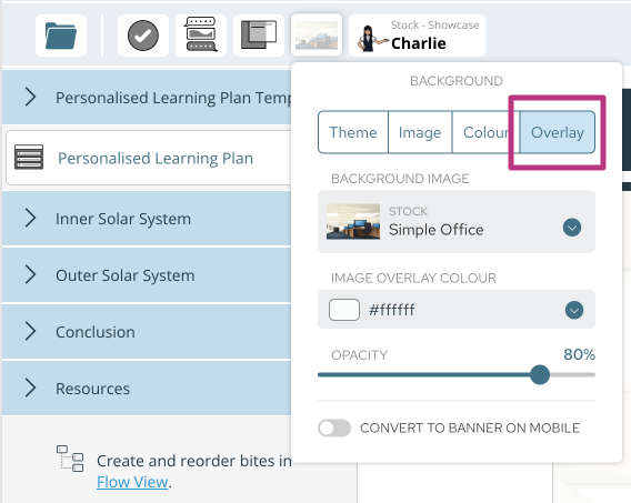
- Or a combination of both – by using the transparency feature you can tint your image with a coloured overlay.
How:
To add a transparent overlay, locate the background option in the top left corner of your screen.


Using the same method on conversation screens can help lift up and highlight the character over your background image.
Background + No Overlay Background + Overlay


Background Images on Mobile Devices
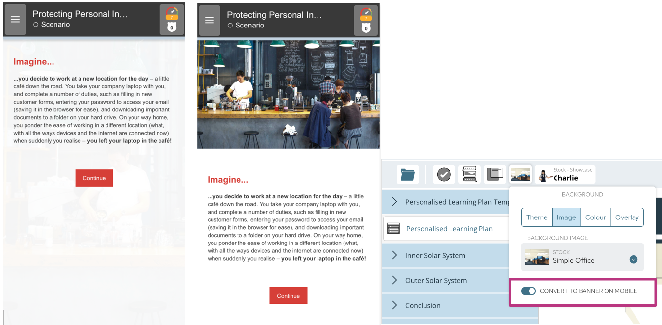
It's important to note that if you plan to have your course accessible on mobile devices or other touch screens, background images display differently when in portrait view.
If your background image provides important context for your content, you will need to ensure it can be displayed in portrait view on your device. Here, you should activate the 'convert to banner on mobile' option.
There is no need to do this if your background is a plain colour or adds no additional information or context to your screen.
Example:

Want to find out more on designing learning for different devices? Check out our blog on responsive learning design, here.
