Our expert design team have put together some design tips for creating on-brand themes that blend both style and functionality.
How
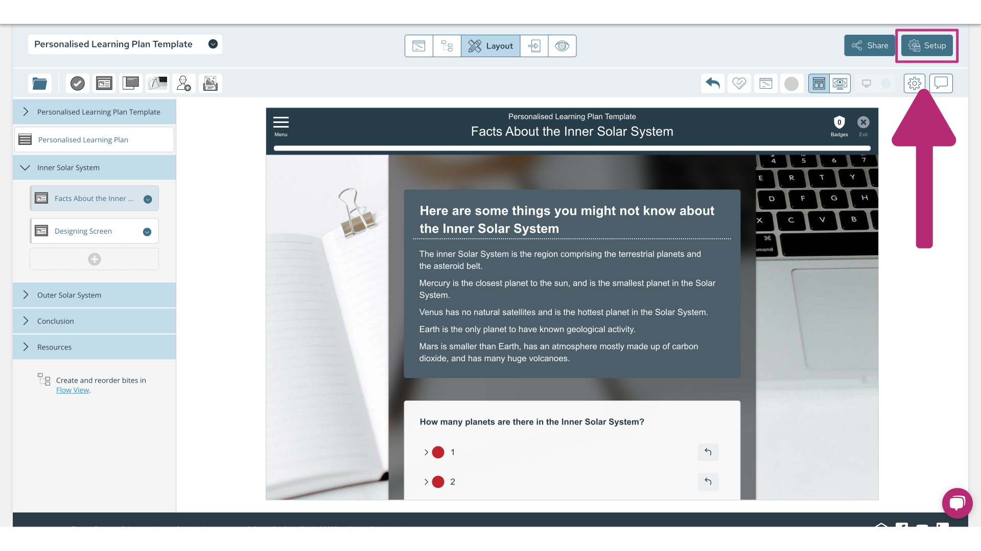
To access your theme editor, navigate to the 'Set Up' button located at the top right of your screen.

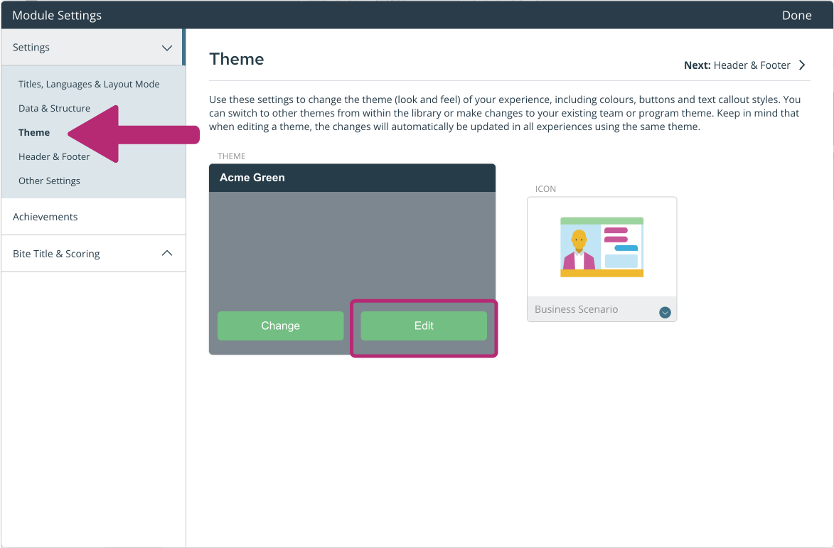
From here, select 'Theme' in the left hand menu then select 'Edit' on your current theme to edit your colours. Alternatively, if you would like an entirely new theme, you can select 'Change'.

This will open your theme editor, where you can begin editing the appearance of your theme.
Colour
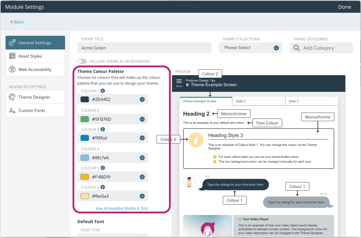
When creating your theme make use of our colour tint tool. Selecting 6 main colours in the theme editor will save you time later - whenever you need to choose colours for icons, backgrounds, title screens etc. these 6 colours from your theme will be available by default.

Each colour corresponds to your module on the right hand side of the page, you can play around with the colours until you have your desired appearance. Select 'Done' in the top right corner of the settings window to save your colour choice.
TIP: You don’t need to choose 6 completely different colours, your branding might only have 2 or 3 to choose from. Choosing a lighter shade of the main colour will provide you with more pre-set tints.
Default Fonts
When choosing your default font (located below the Theme Colour Palette), think about the types of devices your learners will be using to access the learning, as well as readability. Guroo Pro includes a range of fonts to choose from, but not all are supported on all devices. For example, Helvetica Neue is a simple content font but isn’t compatible with Windows PCs (which swap it with Arial or another Windows default font).
Bear this in mind when using Custom Fonts. If you're using a custom font, you will need to choose a backup font, should your custom font not be supported across all browsers.

TIP: To avoid this happening, we suggest choosing Arial for your content text; it is a web-safe font and user-friendly with respect to readability and responsiveness.
You can also change the colour of your default content font, however, we strongly advise caution. Standard content text should be black or dark grey to ensure it is readable. Adding colour to your content text will make it hard to read and should only be used sparingly and when appropriate.
Button Colours
Various buttons on screen will guide your learners through the module. It's important that buttons are visible. Choose a highlighting colour for your button that separates the button from the content and makes it easy for your learner to identify.
Text links are used for your activities, e.g. multiple choice or single answer questions. While resource links are used for hyper links, e.g. external documents or websites.
TIP: When choosing your resource link colour, ensure that the colour you choose is readable on light backgrounds as well as dark ones (if you intend to use darker call outs).
Text Objects - Call Outs
Call outs are styles you can use to highlight text objects with different borders and background colours.
Using call outs is a great way to organise your content and introduce consistency for learners. For example, you might use a lot of different scenarios in your modules. Here you want to create a call out style to use for all your scenarios as a visual cue for your learners. Or, you might have a call out style to highlight important concepts or ideas.
TIP: Add at least one darker, full coloured callout for highlighting important concepts or ideas. In contrast, a grey call out box fits with most brands and helps to avoid over-use of colour.
Speech Bubbles
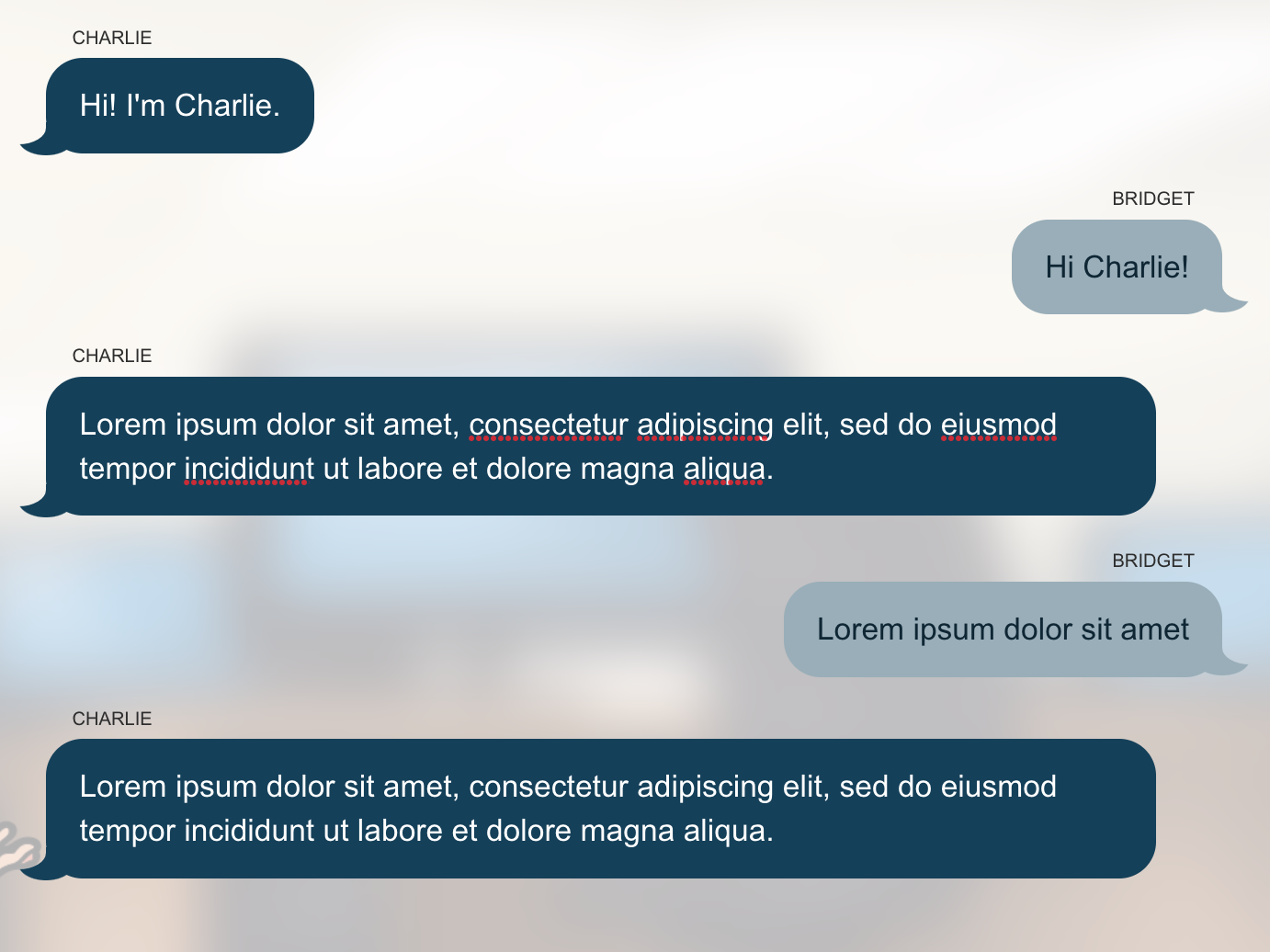
Choose two different colours to make it clear which speech bubble belongs to the learner and which to the character used in the particular module.

NOTE: Thought bubble colours are used when adding a character or learner image to a dialogue.
Feedback Colours
It's possible to change the question feedback colours but we recommend you don't deviate from the red (incorrect) / green (correct) metaphor, with yellow representing an 'ok' response.
TIP: While we suggest you keep the default colours green, yellow and red, you can choose colour tints of these 3 colours that best suit your branding.


